Important Tips For Restaurant Signage
4 Min Read By Zarna Feltham
Almost every brick-and-mortar business needs good signage. For many companies in a variety of industries, the design above the door plays a major role in encouraging potential customers to step inside. Restaurants and cafés are no exception, but there are some unique considerations when developing signs for an eatery. From the types of typography used to the current state of repair, your signage says a lot about the kinds of food and drink you offer, the atmosphere of your establishment and your standards of professionalism.
We look at four great techniques for presenting your restaurant in the best possible light – and some mistakes to avoid along the way.
Effective Use of Images and Typography
Many restaurants have names that inherently suggest a particular style of cuisine. Most consumers are comfortable with assuming that ‘Golden Chopsticks Palace’ is probably a Chinese restaurant, and that ‘Luigi’s’ is likely to serve Italian food.
However, for every restaurant that has a giveaway moniker like this, there are many others with a name that might be anything. Is the ‘City Café’ an upmarket location for designer lattés, or a classic greasy spoon? What kind of food do they do at ‘The Gate’? What about ‘Jackson’s’?
In these situations, it’s often a good idea to use your signage to give additional design cues so that customers have some idea what to expect. Adding an icon of a burger, pizza, national flag or other visual aid next to your logo could go a long way to putting your otherwise ambiguously-titled restaurant firmly in one category or another.
For a more subtle approach, you might also use typography to communicate this information. The style of font used on the sign can say a lot about the style of food and drink you offer. For example, a flowing cursive font for the ‘City Café’ might suggest artisan cakes and locally-roasted coffee – while a brightly coloured, no-nonsense typeface would probably put the consumer more in mind of baked beans, sausages, and other ‘no-frills’ offerings.

It’s worth pointing out that this tip is even more important for restaurants that don’t fit neatly into a "standard" category (such as modern fusion styles of cuisine that might blend two or three influences into something more original). In these cases, it’s more important than ever to use every design trick in the book to help visitors understand your fare and what they can expect.
Establish Your Atmosphere
In addition to understanding the kind of food and drink you offer at your establishment, it’s also good for consumers to have some idea of the atmosphere and ‘vibe’ they can expect.
Is your restaurant bright, vibrant and funky, or cosy and intimate? Could you go there on a date? Should the customer expect to be served familiar, traditional dishes, or challenging artistic creations by an award-winning head chef?
The more information you can provide about the vibe of your establishment, the more you can attract customers who are interested in the type of experience you offer.
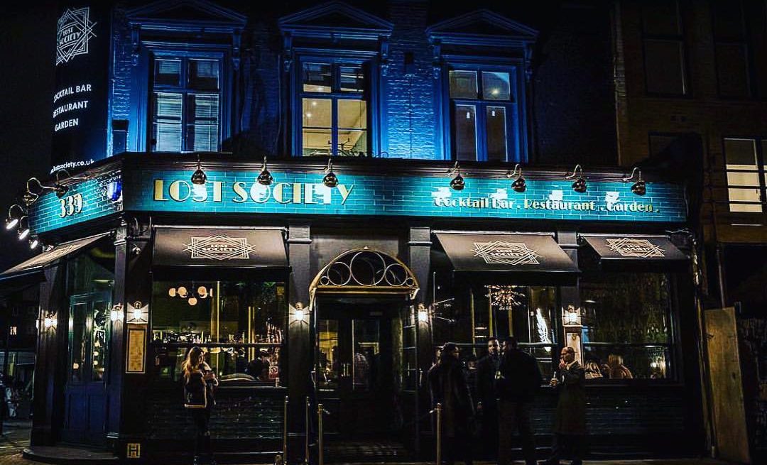
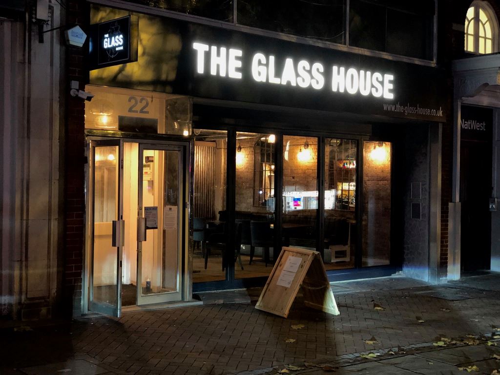
This can be done both through the use of appropriate typography and carefully chosen colors. Warm colors and a traditional-looking font could suggest an old-fashioned, family-run establishment – or a black sign with stainless steel sans-serif typography might imply a high-quality and modern fine dining experience.
Keep Your Sign Looking Fresh
Standards of professionalism are important in all industries – but for food service in particular, customers are especially likely to be put off if they suspect that things aren’t being taken seriously behind the scenes. Unfortunately, a restaurant with a badly maintained front-of-house is likely to leave diners questioning the appearance of the kitchen.
The signage above the door of your restaurant is the visitor’s first indication of how proactively your establishment maintains its standards – and an out-of-date, dirty or broken sign isn’t a good advertisement for the state of your food preparation areas.
To ensure your customers can always see your standards of quality, having the sign redone from time to time and repairing broken letters and lightbulbs is a great idea. Even just giving it a clean or a fresh lick of paint can make a huge difference to the confidence of your potential diners by letting them know that you have everything under control.
It’s not just important for acquiring new diners; for recurring local customers, seeing the fascia of their favourite restaurant lose its lustre over the years can make them start to think that the place may be going downhill or that it is no longer being run with the same care.
Set Yourself Apart
Especially for a restaurant that fills a popular niche in a large city – such as a Chinese restaurant in London – chances are high that you won’t be the only eatery of this type in town.
For this reason, it’s important to distinguish yourself from the others. Do some research on your competitors – what kinds of signage do the other Chinese restaurants have?
You may well find recurring patterns to their design choices, as restaurants operating in the same niches often tend to use the same types of fonts and colours (we are likely all familiar with Chinese restaurants having red and gold signs and the same kinds of Asian-inspired faux-brush-lettered typography).
Of course, these choices are often made because they work well and are great for visually communicating the ‘Chinese-ness’ of the Chinese restaurant, but a little creativity can give you a design which also works well in this regard but is distinct from all the others – perhaps by using a darker colour, or a modern typeface with a more subtle Asian look.
The same can apply to any other type of restaurant. If all the other burger joints in town have a red sign, consider making yours blue or green; if every rival Indian restaurant seems to have used the Papyrus font on their signage, it may be time for yours to break the mold.
At the end of the day, your signage is one of your most basic marketing assets, and in many cases is the first ambassador for your establishment. By getting it right, you can ensure that your restaurant or café is positioned correctly in the public consciousness and that you can continue to attract the kinds of customers who are interested in what you have to offer.
Good typography, imagery and color can help to establish the concept and atmosphere of your eatery – and by keeping the signage fresh and deliberately contrasting the style with that of your nearest rivals, you can position your restaurant for even greater future success.