What’s Fresh in Menu Design?
5 Min Read By Jessica Machetta
At TerraSlate, we help restaurant and bar owners’ menus set the tone for one of the finer things life has to offer — an exceptional and satisfying meal.
Whether you’re opening a new restaurant and creating a menu from scratch or a well- established eatery simply looking to revamp or update your menu, here are some expert tips from our designers that will put your restaurant ahead of the competition before a glass of water even hits the table.
No Dollar Signs
Keeping a sleek, simple design means keeping clutter to a minimum. You don’t want your customers to have to sift through any distractions to get to the good stuff — tantalizing descriptions of dishes they’ll keep coming back for. Making everything $19.95, for example, cheapens the item and let’s be honest, you’re not fooling anyone into thinking saving them a nickel is getting them the deal of the century. If the item is $20, a simple “20” will do. No change, no decimals, no zeroes, no dollar sign. Just 20.
Avoid Price Lining
Keeping with the philosophy of drawing the least amount of attention to the final bill that’s to come, don’t line up all the prices in a column. Columns with numbers on spreadsheets are great when you’re doing cost analysis for your quarterly earnings, not so much when you want to keep prices out of the spotlight and let the dishes take center stage.
Organize Your Menu in a Logical Order
Seems to be a no-brainer, but it bears repeating that your menu order is not the place to get creative. Appetizers first, salads next, entrees and then desserts and beverages.
Put Your Best Dishes at the Top
Again, don’t be tempted to list your food items by price from least expensive to most. We know deprogramming everything you ever learned in middle school math seems illogical, but your restaurant’s signature dishes should go right at the top. Customers are drawn to the upper right hand corner of the menu first, so your entrees that will have them telling their friends about them the next day and posting photos on Instagram are the ones you want to place there.
Follow Simple Design Rules
Stay away from crazy fonts and lots of images. Newspapers and magazines have known for years that for best ease of reading, stick to a serif headline and a sans serif text, or vice versa. Fancy scripted fonts are pretty to look at, but if your customers can’t make out what it says, they’re probably going to think twice about ordering it. Stick to a 10 to 12 point font in descriptors, and just like interior or fashion design, less is more.
Use Color Sparingly
Stark white menus can seem oversimplified and uninviting. Consider picking a warm neutral for the background. We find that nudes and peaches are popular choice because they are easy on the eyes and don’t compete with the menu items and text. Pops of color are OK, but again, a little goes a long way. Burgundy titles with black descriptors will add some pleasing color to your menu without distracting from the menu item itself. Warm colors are best since cool colors like deep blues are known to suppress appetites.
Yes, Size Does Matter
Obnoxiously huge menus are unwieldy for customers to hold, and they take up precious table space. Small menus — 8.5 by 11 trifold — are fitting for venues where they never leave the table, such as beachside tiki bars or diners, and some of our customers still live by the “bigger is better” philosophy, opting for the 11 by 17 size. For them, we’re happy to accommodate, but we find the majority of our clients find somewhere in the middle is best. An 8.5 by 14 (legal size) menu is just right, whether as a front and back single sheet, or folded into a bifold or trifold menu.
Leave a Little Space for Marketing
Encourage your diners to follow your establishment on social media for specials and events. A half inch plug at the bottom of the page with your Facebook or Twitter handle means all those check-ins and “food porn” posts will get you tagged and mentioned online. Got an app? Let them know! (#yourrestaurantname)
One Menu or Two?
Customers are actually more comfortable with fewer choices. If your restaurant has a different breakfast, lunch and dinner menu, you might consider creating more than one menu and switching them out at different times of the day. According to a Bournemouth University study, at fast-food joints, people want six items per category (starters, chicken dishes, fish, vegetarian and pasta dishes, grills and classic meat dishes, steaks and burgers, desserts), wheras in fine dining settings, they prefer seven starters and desserts, and 10 main courses. Psychophysicist Howard Moskowitz once said, “The mind knows not what the tongue wants.”
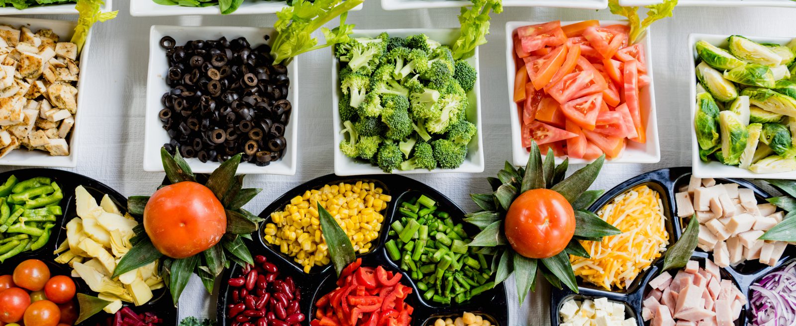
Leave a Visual Impression
Food photos can be tricky, and dishes that taste amazing don’t always photograph well. For example, did you know that milk almost always looks blue in photos? When you see milk ads on television, that’s not really milk at all, but a carefully crafted liquid that looks as white as possible on camera. At TerraSlate, our graphic designers know what looks appetizing and elegant, and what looks tacky. Leave the clip art on your 2005 MySpace page where it belongs. A good designer is always more than happy to work with clients so that the finished product fits their vision.
Don’t Laminate
Laminating menus is a tired practice many restaurants still rely on to make sure their menus last longer than a day and stand up to the abuse customers can dish out. However, after a few wipe downs, laminate gets hazy, making the menus hard to read and giving the appearance of always being dirty. TerraSlate menus are always sharp, crisp and clean, even if you run them through a commercial dishwasher to cut the grease and grime.
Proofread!
We get it, you’re a restaurateur, not an English teacher, right? Not a problem. Our designers and editors went to school for that so you don’t have to worry. We’ll make sure your menu doesn’t go out with embarrassing spelling mistakes or apostrophes that don’t belong. A professional menu designer will always check with you before making any changes. Maybe your famous “cheezburger” is part of the charm that put your restaurant on the map!
Be Health Conscious
Keep allergies and food sensitivities in mind. Not every menu item needs to read like a science journal, but a small note at the bottom about undercooked meat, eggs, gluten or peanut oil is always a smart (and legally correct) thing to do. If you can make substitutions for customers with food intolerances, such as lactose or gluten, let them know. A friendly reminder that you want to accommodate everyone puts your food-sensitive customers at ease and keeps them coming back again and again.
Outshine Your Competion
If you’re the only Louisiana Southern Soul Food Asian Fusion joint in town, then no worries. But chances are, your customers can just as easily choose to eat somewhere else that offers similar options. Put your espionage skills to use and check out your competition’s menu, both online and in person. Then you’re ready to create a menu that is heads and tails better than theirs, drawing more customers through your front door.
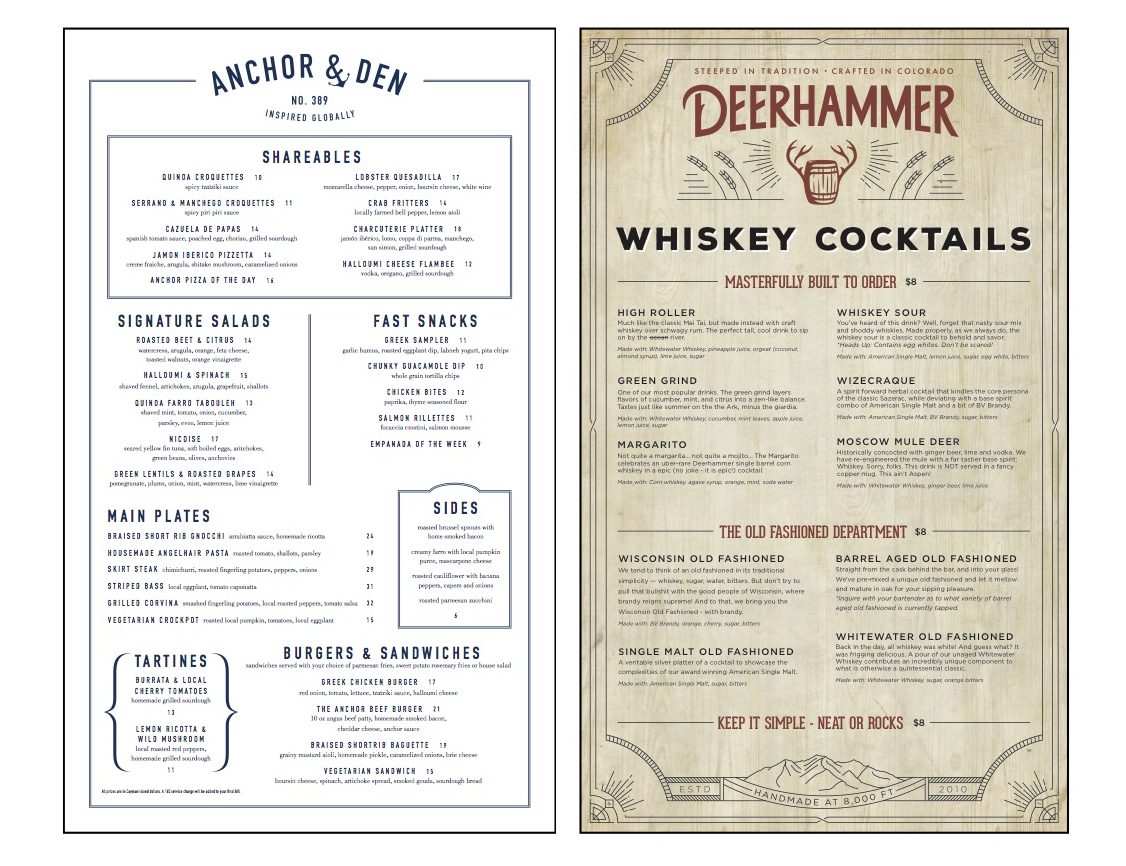
Find Your Favorites
We create thousands of menus at TerraSlate, and we’ve seen them all, from turning the worst of the worst into eye-pleasing works of art, to time-honored traditions that merely need to be reprinted onto waterproof paper. Here are a few of our favorites that we hope will inspire your creative muse.